by nathan thanki
There are a surprising many similarities between designing on a computer and designing “in reality,” with bodies instead of pixels. Designing a poster requires many of the same skills as designing a creative direct action. Both are attempting to convey a message, often a demand or a request, through largely visual rhetoric which, like spoken language, has been developed within social interactions. The process of design is by and large the same: there is collaboration; there is a target audience; there is always a context; and there is a fair amount of soul-searching that goes on once the designer/activist begins to ask basic questions of the form and function of the project. Often the output, be it poster or protest, is part of a broader campaign. There are considerations of consistency, coherence, and timing; of modularity and reproducibility. Can the final product be photocopied or just copied—can it be adapted to different contexts? In any design process, the limitations are crucial. What is the scale, physical and temporal? How much money is available? What is the capacity of the designer/activist team? We are based in a material world that has material limits—this impacts the design process.
Whether it’s developing an argument, crafting an op-ed or blog, creating a campaign platform, or making an info-graphic, a lot of activist work is design work, even if we don’t call it that by name. Because the structure of so many activist groups is largely horizontal—without executives or directors—the design process must be done by a team, which has benefits and drawbacks.. But because so many of the spaces where these horizontal activist groups work are also stomping grounds for big brand NGOs, brand identity is massively important and shapes civil society. NGOs need money to fund their operations and therefore think that they need to have a recognizable brand. The logo is just the tip of the iceberg, but once a reputation has been established it will be used everywhere. Just look at WWF. The same is true for tactics that have been well designed—just think of Greenpeace and their penchant for dropping banners at high profile events, which on one hand challenges often harmful assumptions (for example, that coal is good or clean) but which has also been designed to draw attention to Greenpeace as an organisation. In short, civil society is more like the business world than we tend to think—quite ferocious and with plenty of “borrowing,” subsuming or appropriating ideas. None of which can really be avoided as we depend so much on sharing resources and ideas. This is especially true for civil society groups who are working within the UN climate negotiations (UNFCCC).
The UNFCCC is not an easy place in which to design anything. The space—physical, political, metaphorical, mental—is not conducive to creative thought. There are a host of restrictions imposed by security in an arbitrary fashion, making it difficult to design any kind of “action” or protest. Names of individuals can’t be used, the location is always some dead end that nobody ever goes to, props are hard to get through the checkpoints, and you have about 30 seconds to get the message across to tired and indifferent negotiators or to confused and bored members of the media. As a result, even the best designed actions have a hard time avoiding the pitfalls of being boring (a banner with one whiny demand) or clichéd (the same demand that’s been repeated since 1990). For design, some parameters are necessary, but the restrictions imposed by the UNFCCC, coupled with the conditions (lack of sleep, many collaborators, rushed for time, changing political landscape), are more of an obstacle than an incentive. On top of that, messaging around these issues is pretty tricky. How do you summarise and visualise climate justice? Depicting carbon emissions or the right to sustainable development or technology transfer is some task. Critiquing an entire economic and political system in a single poster or action, and doing it convincingly, is impossible. Nevertheless we try.
This year, for COP19 (the 19th Conference of Parties), Earth in Brackets’ and allies design process began weeks beforehand. Coming off the back of Reclaim Power!—a global campaign against dirty energy—we had momentum and better working relationships among the member groups. We knew the COP would have a heavy corporate presence as preparatory meetings had been shut off for NGOs but open for business. We also knew in advance of the World Coal Association’s plans to have an “international coal and climate” summit in Warsaw at the same time, and that the Polish Environment Minister as well as the UNFCCC Executive Secretary would speak there. All of our collective intelligence was shared via email and conference calls. Based on experience from previous negotiations we knew what the limitations were likely to be, and knew the general progression of events as well as the course of emotions that many go through. This informed the planning process—you don’t have a cathartic, aggressive, action on the first day when everyone is still hopeful. After the call a few of us at COA got together to brainstorm what specific actions we
could do and began designing them. It was difficult because we didn’t properly know our canvass yet, and none of the actions we brainstormed were done exactly as planned when we eventually got to Warsaw. But the same could be said for any design project. We identified some materials that we would need (certain banners and props), made spreadsheets to see who would bring what, and prepared in advance any graphic material. For the most part we wanted to keep our actions unbranded—to avoid trouble with the UN, and because we are climate justice activists, not fundraisers for large NGOs.
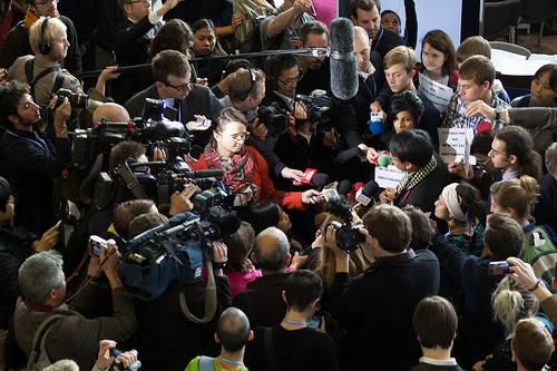
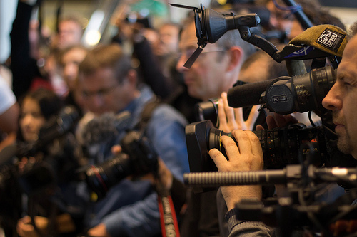
On the ground in Warsaw many different groups were trying to design actions. Youth groups, brand NGOs, even governments all tried to use means other than written statements to get their message across. But very few people acknowledge this process as a design process. Even if an action is informed by sound policy analysis, that does not guarantee its effectiveness. There are other considerations which come into play. The activist has to transform themself into an activist/designer. Beyond merely reacting to events, an approach which greatly limits the design process in terms of possibility and time, activists need to be a lot more intentional in how they design their protest. Below is a recap of some of the actions done in Warsaw which I will consider as products of design.
Red dot/#WeStandWithYou
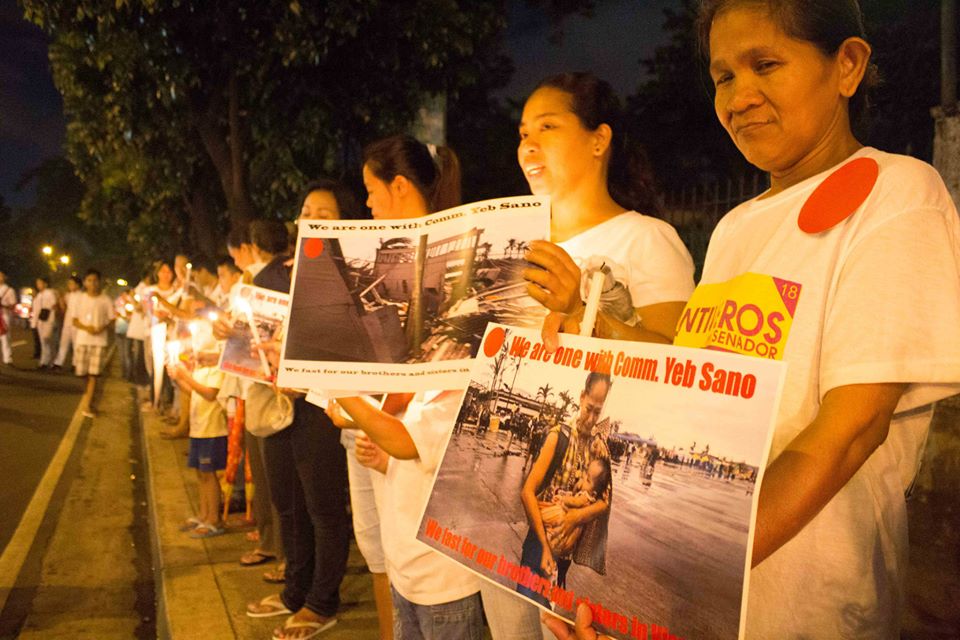
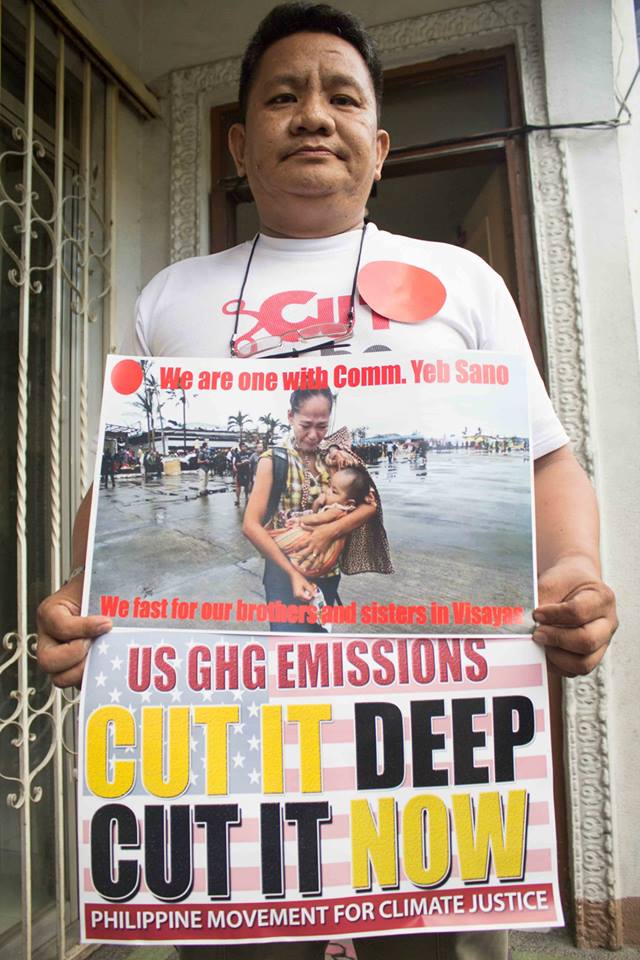
The image of a simple red dot is borrowed from a couple of different sources. The student protests of Montreal in spring 2012 made use of small squares of red fabric. 350.org had also been using the catchphrase “connect the dots” when talking about climate impacts since the summer of 2012. In Doha, December 2012, youth groups began to use red dots in their messaging and actions—which also played on the idea of “red lines” in negotiations. They used the image and the hashtag #WeStandWithYou to show support for developing countries (especially the Philippines, which was hit by super-typhoon Pablo) and their demand to establish a mechanism to deal with impacts of climate change.
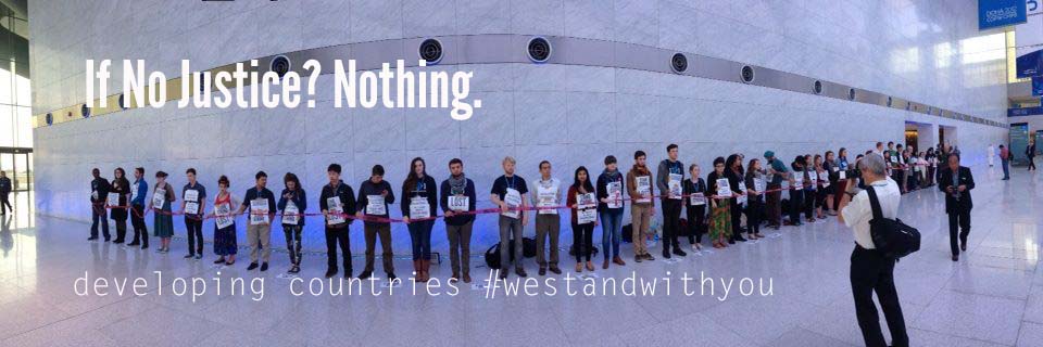
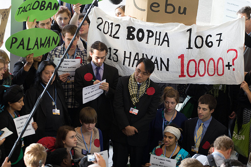
This was carried forward to Warsaw, where negotiations once again were underway as a super typhoon killed thousands in the Philippines. The image of the red dot was revived as youth groups announced that they would join lead Filipino negotiator, Yeb Sano, in his fast for the climate. Small red dots could be worn in solidarity and big red dots to indicate one was fasting in solidarity. The action to “announce” this was well attended by media—probably too much so, as their presence (and ferocity) had security on edge and forced the MCs to begin before all the speakers had even arrived. The presence of the red dots in the photos from the action—which was more like an informal press conference—linked clearly the demands from last year to the negotiations this year. It also made the red dot a symbol for the fast. This modularity was used by the groups involved to bring more people into the action, even if they were not in Warsaw.
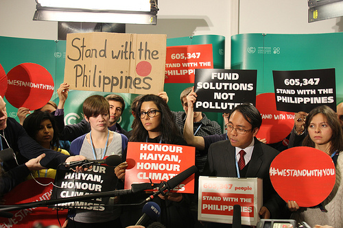
People were asked to print the #WeStandWithYou red dot and pose for it in a photo which they could then submit to a tumblr that was set up. Hundreds of photos were sent in. The red dots recurred throughout the two weeks in Warsaw, including an action where Yeb “handed in” the 600,000+ signatures to his Avaaz petition to the UNFCCC. This action, or series of actions, was well designed: a simple image (the red dot) was used to convey a clear message (of support for Yeb’s fast and for the demands of developing countries) in a way that encouraged participation not only in Warsaw but around the world. It bled into many other actions (350.org held “vigils” for victims of the typhoon) and allowed everyone to add their own climate justice messaging. This last point is negative as well as a positive of the way the action was designed—it left the messaging open to appropriation and required attention from climate justice groups to ensure the focus remained on Philippines and their political demands.
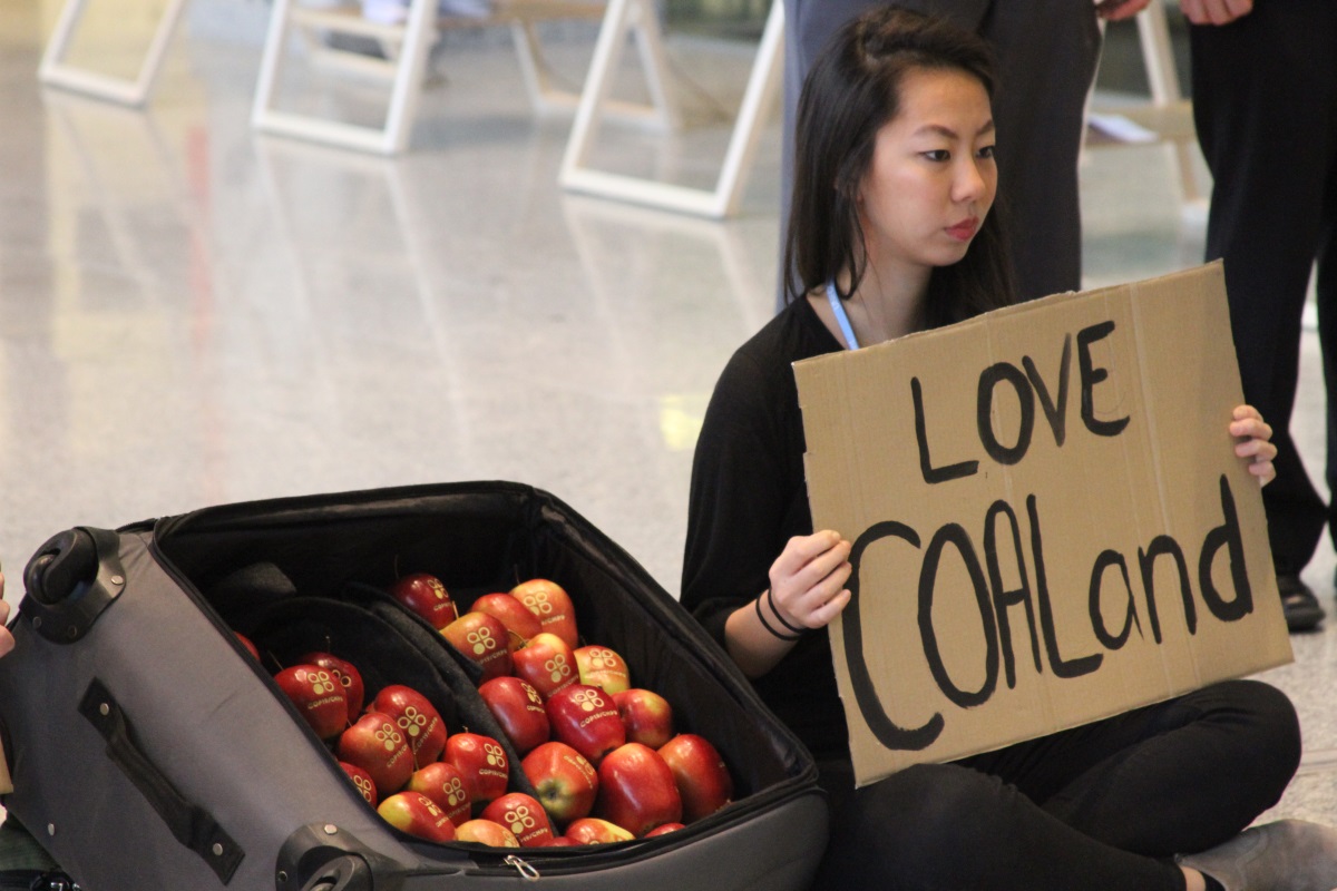
Apples
The idea behind this action was to subvert the use of laser-engraved apples, which were handed out to about 10,000 delegates and observers, and which were roundly and rightly mocked for being an incredible waste of time and money. However, the action that was designed may not have managed to immediately and thoroughly convey its point. A suitcase full of the apples was “sent” from “Coaland” to the victims of the typhoon in the Philippines. The signs held attempted to add to the message: apples and other merchandise should not be the point of negotiations, stopping climate change should be. But when the action is summarised in a photo, as below, something gets lost. Only people in Warsaw, who had paid attention to the apples, understood what the suitcase of apples was about.
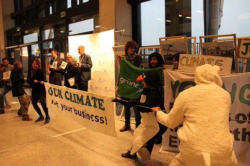
Tug-of-War
This action was aimed at showing the imbalance of power and influence in the process between civil society and corporate lobbies. Visual cues used to indicate actors were the costumes worn: casual for people (plus penguin and polar bear costumes to represent other life forms that are suffering from melting ice caps), suits, sunglasses, and logos for corporations which were sponsoring the COP. The rope, of course, represents the climate (what the fight is about). This was a repeat of an action that has been done before, and for good reason. The entire message can be captured easily in the photograph. Although acted out as a skit involving an MC and cheerleaders, the message of a fight between 2 opposing forces is clear. Not shown in the photos here is the image of the corporations lying on their backs having lost the tug-of-war. The design of this action played to the strengths of the activists—few props were required, little rehearsal was needed, and the targets were clearly identified.
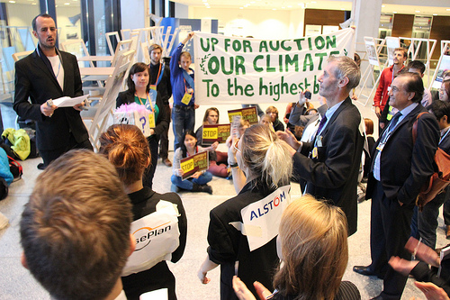
Auctioning the COP
In another action designed to highlight the corporate capture of the COP, activists held a mock auction of the negotiations. The design of this action involved writing a fully-fledged script for the auctioneer. The result was a much longer skit, perhaps too long, and not such an easy photo opportunity as it lacked certain props that could maybe have made the message clear. A podium with an auctioneers hammer, for example, would have conveyed the idea much more easily. However, taken as a whole package it worked well—if you were there that day you would understand what was going on—and this was because the action was designed to incorporate more than just visual cues.
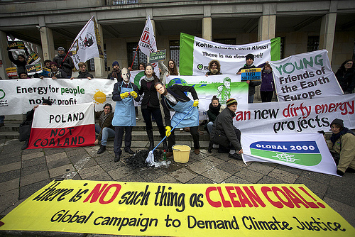
Clean[ing] Coal
Free from the UN restrictions on “personal attack,” activist/designers have a bit more leeway. Several groups took advantage of this outside the Coal Summit, held in a government building on a busy street in central Warsaw. Designing an action for both the Polish and international media, activists used masks and other props which they had made in advance to implicate Polish PM, Donald Tusk, Environment Minister (and President of the COP), Marcin Korolec, and UNFCCC Executive Secretary, Christiana Figueres, in the greenwashing of an extremely harmful energy source—coal. Both Korolec and Figueres had ignored civil society pleas not to speak at the event and so using their faces was an easy decision. The props were simple but effective—some coal, some soap, a bucket and a mop. The mess made lasts beyond the photo opportunity—passers-by and summit attendees saw it too. The double meaning is provocative: coal cannot be clean, and the impacts are lasting. Although designed to be a good photo, this action went a little ways beyond that, as a performance and even as an installation.
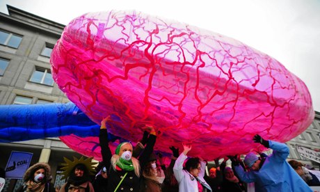
Lungs
Another pre-planned action for outside the Coal Summit focused on health impacts of dirty energy. I was not involved in any way with this action but know that it was designed as such for two reasons: the first being that because it was felt the Polish public would respond more positively to a health message than to a climate or energy message, the second being that the activist already had the prop. It was a giant pair of inflatable lungs that look worryingly like testicles. The message was further confused by the lungs being “normal” (apart from looking like testicles), which, given the health impacts of coal, wouldn’t be the case. In the end, the effectiveness of the design was overshadowed (literally) by a Greenpeace banner drop from the top of the building, which was the photo that most media outlets used to depict the day’s protests. As we already know, branding and competition for attention among NGOs often takes centre stage.
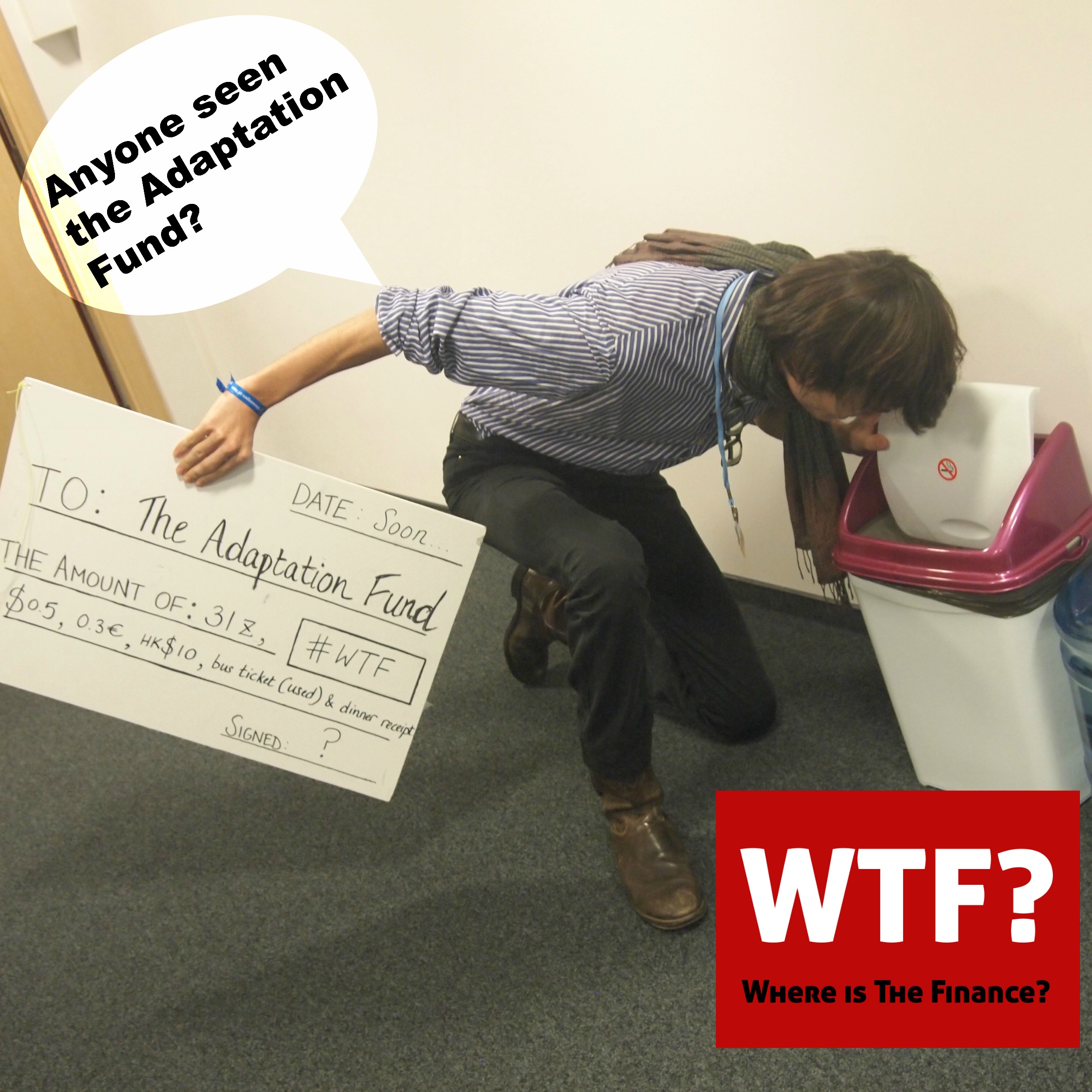
WTF: Where’s the Finance?
More of a mini-campaign than an action, the “Where’s the Finance?” idea plays on the popular acronym “WTF”—which usually means “what the fuck?” Requiring very few resources and capacity of designer/activists, the idea fed into an on-going campaign around climate finance. The meme-like images can be re-used and modified to serve different purposes. They remain targeted and with a clear demand which, as it came from the Finance group of the youth constituency, was informed by policy. Although not the most sophisticated graphics, the images were generated quickly and easily. They were supplemented by another action which was designed to spell it out using bodies. Essentially this action seems to prove that Ockham’s razor applies to design as much as logic.
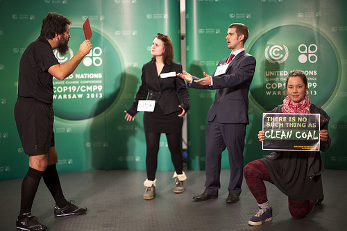
Kicking Coal out of COP
Making use of the location, this clever image shows a referee dismissing corporations from the COP by giving them a red card. Another simple and easy action, though it required foresight to bring the referee costume to Warsaw. Get into the spirit with an extensive selection of Halloween Costumes. As well as using humour, the action gets the message across instantly. It goes to show that good design requires preparation and knowledge of the context in which the output will find itself.
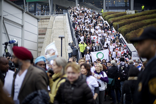
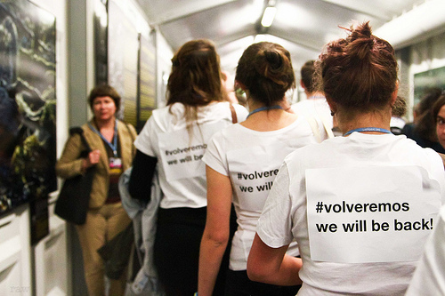
#Volveremos
The second last scheduled day of negotiations witnessed by far the biggest action, certainly in terms of numbers of participants. It was planned (designed) as an open secret among far too many people. Therefore, a final product which was well polished, coherent, and pointed was always unlikely. Given the circumstances—the political effort expended to bring on board all the big brands and different movements/constituencies meant that less effort could be devoted to design—it was wildly successful. The basic elements were worked out earlier—t-shirts were bought (300+) and the signs were printed. On the day it was obvious something big was happening. Although the action wasn’t exactly designed to make an interesting visual/photo, being more a show of strength and unity among civil society groups, it ended up providing the best photo of COP – 800 people walking out from the stadium down the stairs. Because of the numbers of people and groups involved, and because of the diverse nature (some from big brands, some from social movements, some from labour, some from indigenous networks) the messaging was diluted, if not somewhat confusing. The white t-shirts were a good visual unifier, and the red dots also reappeared, but it required a close up shot to see the words “volveremos, we will be back.” The colour white, while cost-effective, is also the colour of surrender—sending the exact opposite signal that was intended. This action pushes the limits in terms of the collaborative design process and raises interesting questions about how to find balance between inclusivity in planning and effectiveness in implementation. Still, though, the image of hundreds of people streaming out of the negotiations became one of the iconic images of the conference.
- (C) Earth in Brackets
Thank you for writing this!
Awesome article, Nate. It is nice to keep track with what you guys are up to.